Brand guidelines
Our brand, at a glance.
Official Finite State logos and backgrounds, and the essentials for using them: clear space, color, type and visual motifs. For partners, vendors, event teams and press.

01 // Logo files
Use the official files only.
Never screenshot, trace, retype or rearrange the logo. SVG scales to any size; PNG is for tools that can’t take vector files.




- Logo kit (ZIP)
The whole kit
Every file above in SVG and PNG, plus the one-page cheat sheet, in one zip.
02 // Clear space & size
Clear space and minimum size.
- Clear space
- Keep a margin of x on every side, where x is half the height of the icon. Nothing else enters that space, including type, other logos and the edge of the page.
- Minimum width
- Horizontal: 1.25 in in print, 120 px on screen
- Vertical: 0.75 in in print, 72 px on screen
- Bug: 0.25 in in print, 16 px on screen
03 // Logo on backgrounds
Match the version to the background.
Dark backgrounds are the default. On anything busy or low-contrast, switch versions or move the logo.
Color on dark (preferred)
Color on light
All-white on brand imagery
One-color dark for print
04 // Don’t
Keep the logo as designed.
Never recreate, rearrange or modify any part of it.
Recolor or change its tones
Stretch, squash or warp
Rotate or tilt
Add shadows, glows or outlines
Place on low-contrast color
Crowd the clear space
05 // Color
Dark leads. Orange accents.
Orange is the signature accent, used sparingly; teal marks actions and highlights. Use two accents at most in one piece. For CMYK, match the PMS swatch on press.
Orange
RGB 242 114 41PMS 1585 CTeal
RGB 27 208 184PMS 3255 CNear-black
RGB 17 18 20BackgroundsWhite
RGB 250 250 251Headlines
06 // Type
Three typefaces, all free.
All three are on Google Fonts. Don’t substitute Arial or Times.
Space Grotesk
Get it on Google Fonts ↗Headlines
Bold, with tight tracking
Instrument Sans
Get it on Google Fonts ↗Body copy, labels and buttons
Regular to SemiBold
IBM Plex Mono
Get it on Google Fonts ↗Data labels and tags only
Regular and Medium
07 // Background images
Set the stage.
Official backgrounds for slides, banners and event screens. Use one per surface, and keep type in the darkest, quietest part of the image.

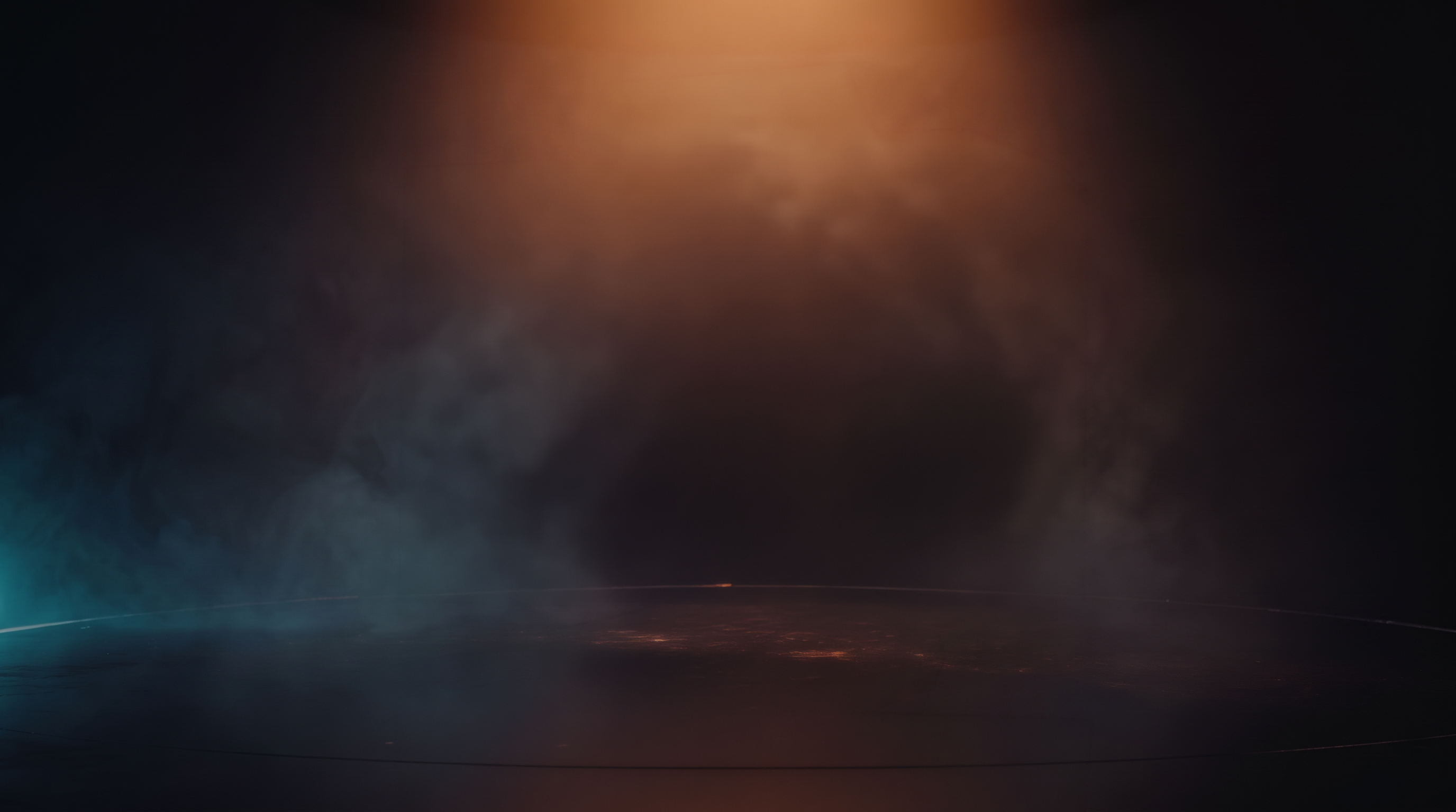
Cinematic Stage
Orange key light, teal rim and haze over a reflective floor. For covers, hero moments and device lineups. Keep type in the upper center or on the left.
2752 × 1536 PNG

Dual Glow
Orange light top right, teal bottom left. For covers, hero sections and calls to action.
1600 × 900 JPG

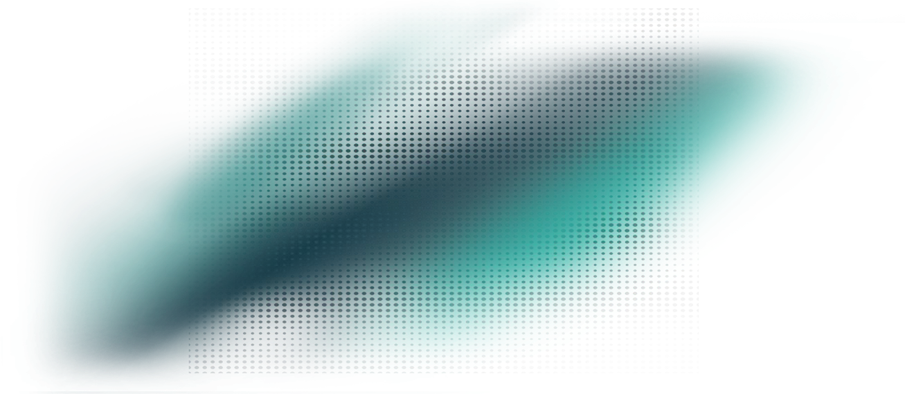
Teal Drift
Teal-green light from the top right. For section breaks and overview panels.
1536 × 1024 JPG

Orange-Teal Starfield
Orange bottom left, teal top right. For high-impact, full-bleed moments.
1600 × 900 JPG

Near-Black
Near-black with a faint vertical stripe. For content-heavy slides and pages.
1600 × 900 JPG
- Backgrounds (ZIP)
All backgrounds and textures
All five backgrounds, the five textures below and a short usage note, in one zip.
Textures
Transparent PNGs. Layer them over a dark background at 5 to 15% opacity, one texture per surface.



















08 // Visual motifs
The details that make it ours.
Use one or two per piece, never all at once. Each example below shows the motif in use.
- cam-042101Analyze · Mapped
Tech corners
L-shaped brackets frame key content: a hero stat, a callout, one featured card per section. Never every card in a grid.
02 // Prioritize
Fix what’s real.
- Confirm what’s reachable
- Record the decision
Slash marks
Two slashes separate a section number from its label, and lead bullet points.
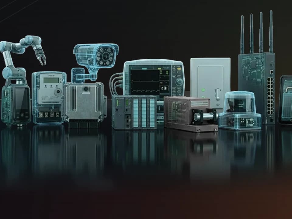
Scan-line reveal
A teal scan line passes over a device and turns its casing to glass, showing the electronics inside.
// Evidence
Light passes through. Edges stay sharp.
Glass panels
Frosted, see-through panels with a fine light edge, for cards and callouts over imagery.
Line and dot grids
Faint grids behind heroes and data. Teal lines for hero surfaces, gray dots by default.
03 // Assure
Prove what you decided.
Hex mark
The logo bug, very large and faint, behind covers and section breaks. Always the real file.
09 // Words & imagery
Name it right. Show the devices.
Our name
Write it as Finite State: two words, title case. The all-caps form belongs to the logo. Describe us as the Product Security Assurance platform for connected devices.
Messaging
Use approved lines, like “What’s inside matters.” Calls to action are actions (“Get a Demo”), never “Learn More” or “Click Here.”
Imagery and approvals
Devices are the heroes. No stock photos, lock icons, hoodies or Matrix-style code. Customer names, logos and quotes need written approval.